The ASX 200 hit fresh new record highs this week, finally surpassing the 2007 highs – a full six years longer than the S&P 500 did. At least this decades’ effort was better than that post-1987 crash when it took the Aussie market almost 10 years to make new highs. The S&P 500 did it less than two.
The bull market experienced in the US stock market is the longest in history and with all the developments occurring globally from the trade war, to missile tests, to Middle Eastern tension and currency manipulation – what do I watch, for signs of a market top or a correction?
The first thing is obviously price action. Nothing spells concerns like a technical chart pattern that show a huge a top in formation and the risk of downside. Some people think charts are useless and some chartists think fundamentals are a waste of time. They are both wrong. If you are not making millions using just fundamentals or just charts, maybe it’s worth considering learning the positives of the other. Just a thought.
Unfortunately though, the major index averages can mask for many years what is occurring begin the scenes. Take for example the GFC. The major indices peaked in December 2007, however, the root cause of the GFC – the banks and home builders – had peaked up to three years earlier. In fact, by the time the US indices peaked, the home builders had already lost 70% of their value. Point being, is that there is generally warning signs developing in specific sectors. So I am always on the lookout for sector wide trends that are inconsistent with the bull market. As an example when I turned bearish on the domestic property in 2017, it was the direct result of seeing the banks having peaked in 2015. The peaks in the retailers in 2016 also gave clues not all was right with the consumer.
When it comes to looking at specific sectors, ETFs can be great in giving a holistic picture of what is occurring in that space. Just do a quick Google search to see the components of the ETF, because they can change and they can have components that don’t quite match up with their titles. For example one of the main components to the Rare Earth ETF (REMX – ARCA exchange listed) is lithium producer Pilbara Minerals (PLS).
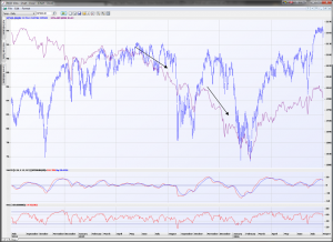
One of the main ETFs I use for a broad gauge of how the high-yield corporate debt market is performing are the iShares High Yield Corporate (HYG.ARC) and the VanEck Fallen Angel High Yield (ANGL.ARC) ETFs. Commonly it is equity markets that are often the last to react to stress appearing in other areas of financial markets and most often financial distress – as reflected in the willingness of investors to own corporate debt – is the first witnessed in this space. If there is little stress amongst junk bonds, the medium and longer-term capacity for companies to pay back debt is not under scrutiny. Take a look at the correlations below between the S&P 500 and the HYG ETF (in purple).
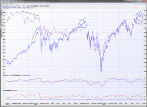
I show the divergence that occurs between the final push in US equities that isn’t matched by the same level of exuberance in the HYG. Bond investors are not as “blind” as equity investors and thus, invariably there is a price adjustment in equity markets as they catch-up to the concern shown by bond investors. And obviously the area of the market that is going to hit the first spot of difficulty will be the junk end of the market.
Below is another great example back in the 2015 and 2016 where the HYG ETF in purple was showing clear weakness and distress that led to a huge and sudden correction. There was a second market correction months later (second arrow) because the high yield corporate bonds continued to experience problems. If this ETF is heading lower for a prolonged period and equities are not adjusting the same way, then be wary. This is a very powerful yet very basic way that any investors with any level of experience can obtain an overview how credit markets are performing.
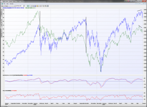
I also tend to watch the performance of the US housing market using not just the individual homebuilders but the S&P Homebuilders ETF (XHB.ARC). This ETF is shown in green with the S&P 500 below. I have highlighted the big corrections in the S&P 500 by two vertical black lines and it can be seen clearly how much the homebuilders had fallen BEFORE the S&P 500 dropped. On both those occasions I personally used it as a warning sign for the broader market. There is some divergence registering now as well, warranting caution. I find that the hombuilders are a good barometer of consumer sentiment towards making large purchases and as well a reflection of how consumers are reacting towards interest rate movements. Are lower interest rates having a positive effect on the willingness of people to build a home? How are higher interest rates affecting them. A lack of willingness or decline in sentiment can have repercussions throughout the broader market as the evidence clearly shows.
Finally, an eye on bond markets and other regional equity indices are important. Europe, Japan and Hong Kong are key. Broad weakness (not just one individual market declining as an outlier) can start to signal that investor sentiment is waning. Higher volatile markets (including emerging markets) can reflect investors’ appetite for risk.
Naturally I look and use a greater variety of tools and indicators to suggest trouble is on the way in global markets, but if you use just these core ones like I do, you will be better informed to see that writing on the wall before the real trouble hits.