
written in collaboration with Brad Livingstone-Foggo, Head of Marketing – Australia
The difference in returns among ASX-listed companies has been getting some coverage recently in the financial press.
It is now widely accepted that the distribution of the returns of individual shares in the market are not distributed normally. Rather, they are skewed. The degree of skew is measured by a value called ‘skewness’.
Skewness is a statistical measure used to reflect the degree of asymmetry of a distribution. You may recall, a normal distribution curve looks like this:
Figure 1: A normal distribution curve
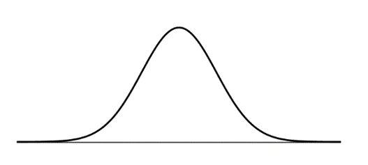
In a normal distribution curve the median, the mean and the mode (the highest point of the curve) are all equal.
Statistically, a normal distribution curve would have a skewness of 0.
We were all taught to assume that real world variables are normally distributed. Investment theory enthusiastically adopted this, but in real life the returns of stocks are not normally distributed.
Instead they skew, with a long tail to the right like figure 2 below. For the mathematically inclined, figure 2 has positive skewness. A negative skew has a long tail to the left.
Figure 2: Skewed with long tail to the right
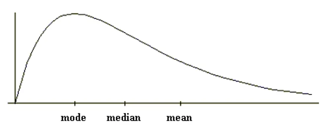
A feature of a positive skew is that the mean is higher than the median, which is higher than the mode.
In 2018 we released a paper, Why equal weighting outperforms – the mathematical explanation. The paper analysed the return distribution of the companies in the S&P/ASX 200 Index. That paper included the following chart of the three-year returns generated for each company in the S&P/ASX 200 Index at the start of that period.
Figure 3: Returns for the 200 largest Australian shares, three years to May 2018
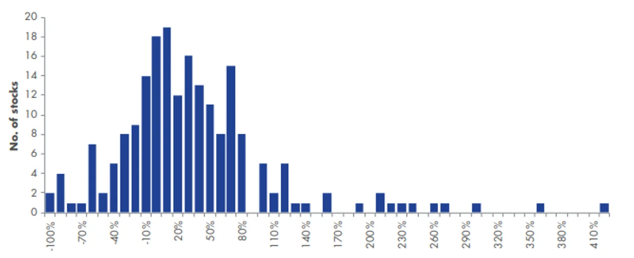
Source: Bloomberg, VanEck.
The returns of stocks on the ASX have positive skewness. This is because the returns in figure 3 look more like figure 2 above, not figure 1. The average (mean) in this data set is 34%, well above the median of 21% which itself is well above the peak of the histogram (the mode) at 10%.
The chart also reveals:
- The lower returning groups are bunched together on the left-hand side. One of the reasons for this is that stocks cannot lose more than 100%, while the upside potential is unlimited.
- The peak is way to the left. Many stocks have relatively low returns.
- The tail to the right is very long. A small number of stocks have a very high return. An investor would like more exposure to these stocks.
Smaller versus larger stocks
The paper, Why equal weighting outperforms – the mathematical explanation further analysed the data, breaking the returns down by company size. This showed that mega-sized stocks are not likely to be at the extremes of the positively skewed distribution. Figure 4 below plots the returns against the market capitalisation of each stock at the beginning of the period.
Figure 4: Returns for the 200 largest Australian shares versus their market capitalisation, three years to May 2018
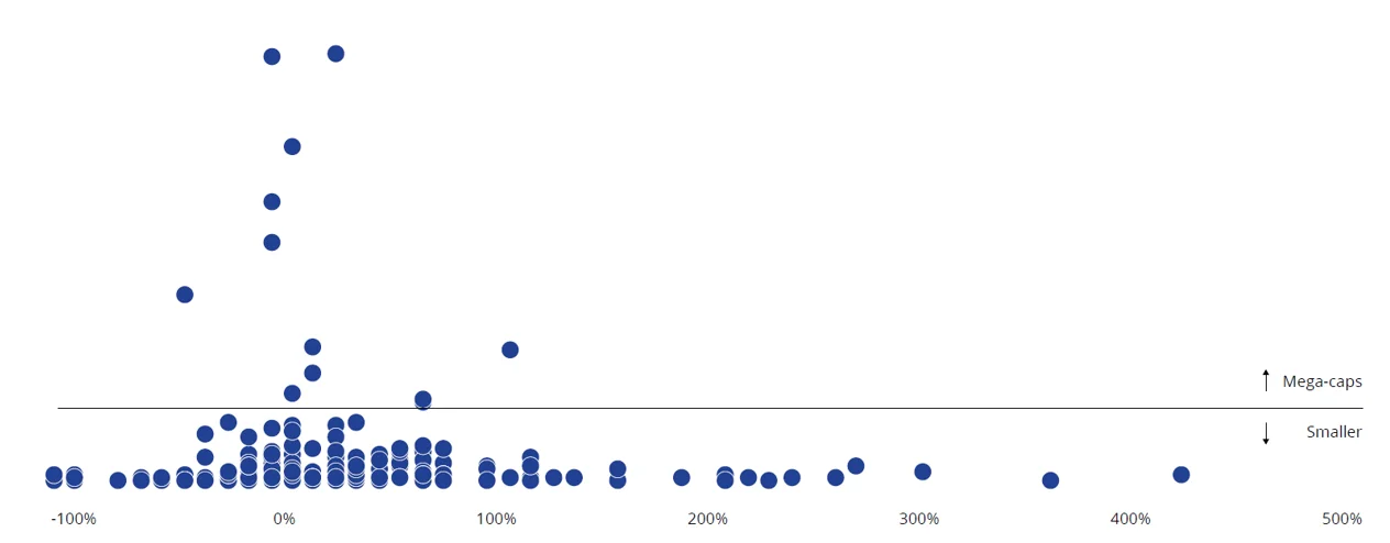
Source: Bloomberg, VanEck.
Figure 4 shows that the companies that were the largest are far more narrowly distributed than the rest of the stocks. The extremes are populated by smaller stocks than these mega-sized companies.
The twelve mega-cap stocks, above the line, have a performance range of -36% (Telstra) to 107% (CSL) compared to the complete range of -100% to 416%.
Skewing returns in your favour
Intuitively then, it would make sense to construct a portfolio that has less exposure to the mega-caps, with narrow returns, and more to those smaller-sized companies, with a wide variance of returns.
An evenly spread portfolio like VanEck’s Australian Equal Weight ETF (MVW), for example, is fishing with a much bigger net. MVW currently includes 83 different companies, where the weighting is high enough that a rocketing share price won’t be lost as a rounding error.
A fund benchmarked to the S&P/ASX 200 Index can only have significant holdings in the biggest stocks of which there are only around a dozen. MVW has ~70 extra significant holdings, all smaller than the mega-caps that dominate the S&P/ASX 200 and all 70 of them have a chance of being the star performer.
Figure 5: MVW vs S&P/ASX 200 Index constituent rank and weightings
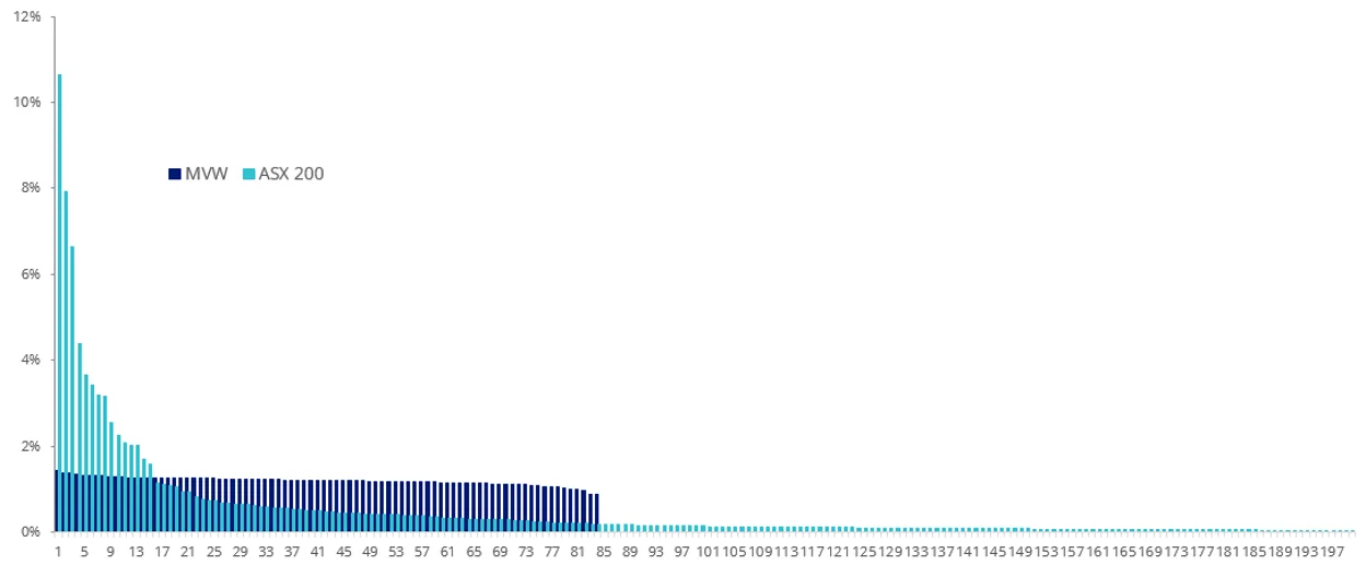
Source: Factset, as at 31 March 2023
Nobody knows which company’s share price will be the next 300% to 400% performer but it is better to hold the additional 70 raffle tickets.
According to Why equal weighting outperforms – the mathematical explanation, “Equal weighting has consistently given greater exposure to the smaller stocks than market capitalisation weighting does.” That is why it outperforms, the paper found.
Revisiting those findings (again)
In 2020, after the sharp sell-off in equities due to the COVID-19 crisis, we thought it would be prudent to consider the distribution of returns in the context of a market recovery. This was presented in The road to recovery: An analysis of equal weight performance in Australia after market declines.
The 2020 paper showed that in the three-year periods following significant market downturns equal weighting outperformed.
Again, the reason for equal weight’s outperformance was attributed to the skew of returns on ASX. In each of the recoveries analysed, the mega-caps had a narrower range of returns compared to the wider range of returns of the smaller-sized companies.
In The road to recovery: An analysis of equal weight performance in Australia after market declineswe posited that an equal weight portfolio was potentially positioned to outperform from the market falls in early 2020, if the recovery resulted in a similar skew of returns as past recoveries of the Australian equity market.
It is now three years since the sharp sell-off in 2020 so, let’s have a look at those results.
Figure 6 shows the skew of returns of the 200 largest Australian shares, by size over the past three years. It is immediately noticeable in figure 6 that the skew of returns of the large companies and skew of returns of the smaller sized companies is almost identical to the returns presented in Why equal weighting outperforms – the mathematical explanation, figure 4 above.
Figure 6: Returns for the 200 largest Australian shares versus their market capitalisation, three years to March 2023
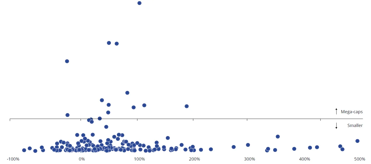
Source: Bloomberg, VanEck
The mega caps, again, have a narrower range of returns than the smaller-sized companies have a wider range of returns.
The twelve mega-cap stocks have a performance range of -1% (CSL) to 205% (Fortescue Metals1) compared to the complete range of -75% to 498%.
And, over the past three years, equal weighting as represented by MVW, has outperformed.
Table 1: MVW Performance as at 31 March 2023
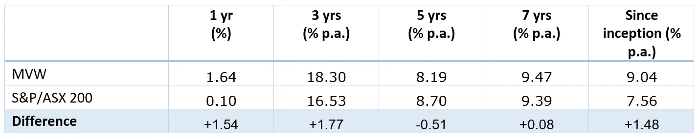
Inception date is 4 March, 2014. Source: Morningstar Direct, VanEck. Results are calculated daily to the last business day of the month and assume immediate reinvestment of all dividends. MVW results are net of management fees and other costs incurred in the fund but do not include brokerage costs and buy/sell spreads incurred when investing in MVW. Past performance is not a reliable indicator of future performance. You cannot invest directly in an index. The S&P/ASX 200 Index is shown for comparison purposes as it is the widely recognised benchmark used to measure the performance of the broad Australian equities market. It includes the 200 largest ASX-listed companies, weighted by market capitalisation. MVW’s index measures the performance of the largest and most liquid ASX-listed companies, weighted equally at rebalance. MVW’s index has fewer companies and different industry allocations than the S&P/ASX 200.
The explanation (revisited)
Why does equal weight outperform market capitalisation indices?
Equal weighting consistently gives greater exposure to the smaller stocks, which outperform larger stocks, than market capitalisation weighting does. It is as simple as that.2
Last week we released our new findings capturing the recovery subsequent to the COVID-19 falls here – The road to recovery (revisited): Further analysis of equal weight performance after market declines.
FOOTNOTES